Typofgravey
Liam Gillick | Oliver Hartung | Paul O'Neill | Simon Patterson | Giles Round | Bob & Roberta Smith

Curated by Richard Priestley
Would you be confident to swallow one of the pills if the cover on the packet contained a list of ingredients written in a hand rendered scrawl, rather than the authoritative, Swiss, clean, minimal typeface we are used to and feel secure with?
The majority of the western world reads and writes on a daily basis. It isn't an issue. It isn't even consciously undertaken. It is here that there lies an unspoken form of subversion. It is in the letterforms; they ply us in the designers mould and mood because of their cultural associations and subliminal reference points. The typeface sets the tone of the words being read more effectively than the actual juxtaposing of the words themselves. Whilst anyone forms an opinion pro or con the written argument itself, they are being infiltrated subconsciously by the implications of the shapes of the letters.
The Typographic Circle have been practicing this form of subliminal witchcraft for many years, dressed in their Jedi robes, from a vault in the mountains, or so their monica might imply. They wield the power of the hypnotist. A typographer's craft involves them bending our opinions and leaving no trace of their work. A typographer may a modern day occultist in that they deal with 'the hidden'.
The tactile nature and variable scale of print allows for the continuity of the involvement of the typographer, despite the faceless and unformatted nature of the internet, and everyone is still spellbound.
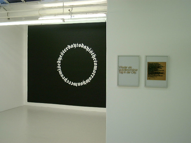
Typofgravy invites artists and designers influenced by letterforms to expand the dialogue around this esoteric craft by recontextualising type within the confines of the gallery for no more purpose than to make the viewer conscious of the letterforms connotations.
